← All work

Case study

Sassy Pear Nails

Brand identity for a nail art studio.

Deliverables
Logo, color palette, typography, illustration elements, business card, social profile mark
Typefaces
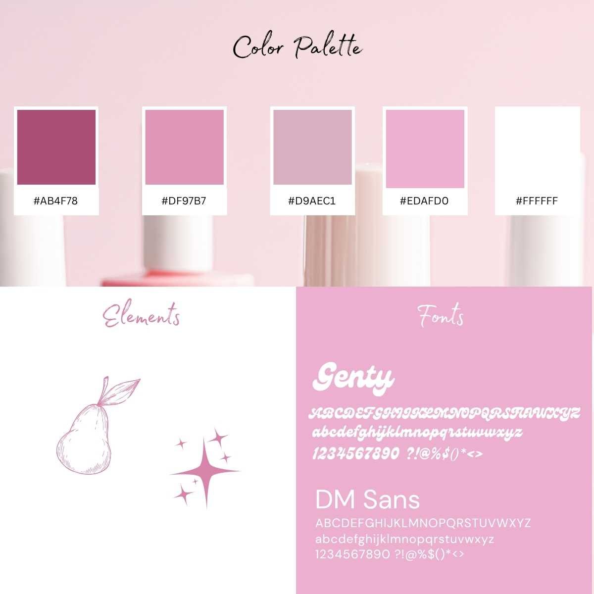
Genty and DM Sans
Sassy Pear Nails logo: a white retro script wordmark with a pink drop shadow on a pink liquid swirl background, with sparkles and a line-drawn pear

The look

A playful, retro identity for a nail art studio. The wordmark is set in Genty with a layered pink shadow, paired with a line-drawn pear and sparkle accents.

A soft pink palette and clean DM Sans text carry the system from business cards to social media.
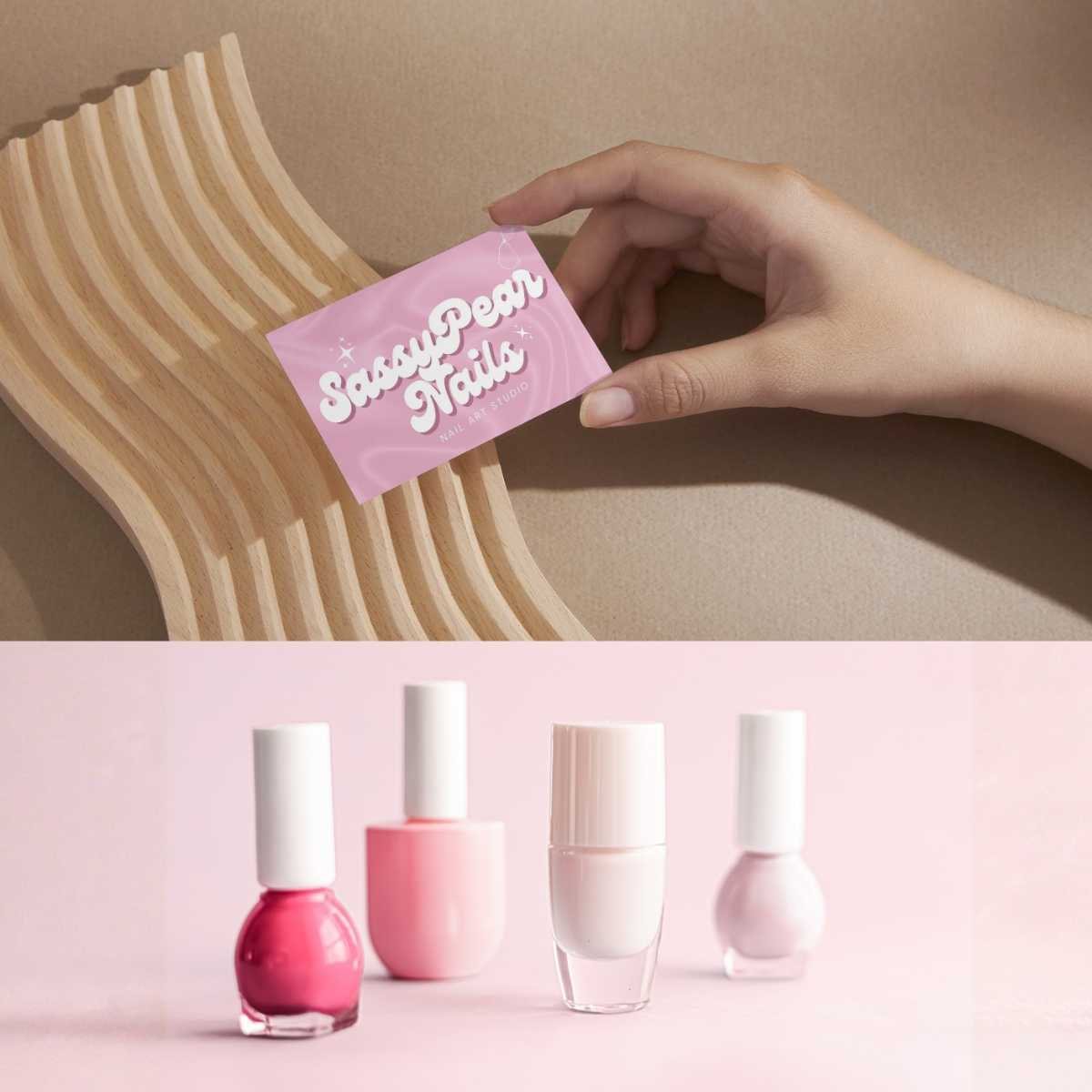
A hand holding the pink Sassy Pear Nails business card above four pink nail polish bottles
Business card mockup
Brand board showing five colors with hex codes, the pear and sparkle elements, and the Genty and DM Sans fonts
Color palette, illustration elements, and fonts
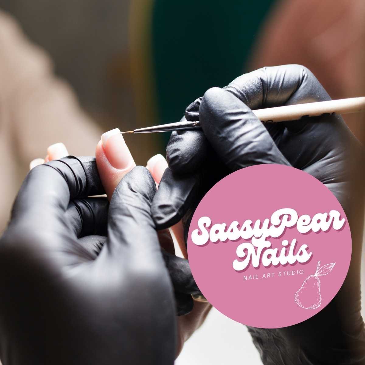
The Sassy Pear Nails circular logo placed over a photo of gloved hands painting a nail with a fine brush
Social profile mark
A white line drawing of a pear with a leaf on layered pink shapes
Pear illustration

Have a project in mind? Let’s talk.

Or email jaclyn@jaclyndesignsstudio.com